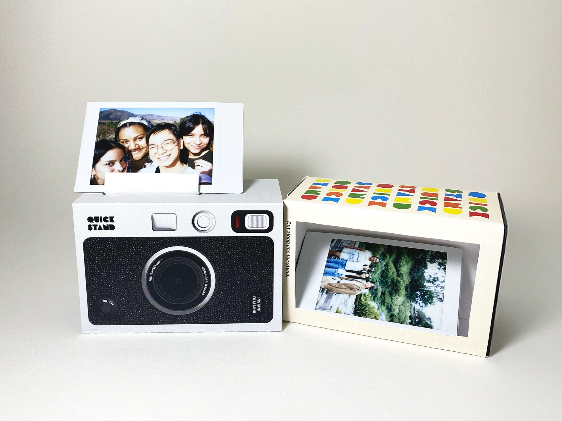
Objective
Reflect cultural attributes of the specific food, country, culture or region. Create an original name/brand for the products and clearly connect the product’s concepts to originating influences. Consider the target audience and life-style values to reflect: organically grown or fair trade practices vs. processed or unfair labor laws. Design a ‘series’ or ‘multiples’ approach—different flavor or types, but all with the same packaging dimensions. The final branding designs are later used and expand the brand to other products.
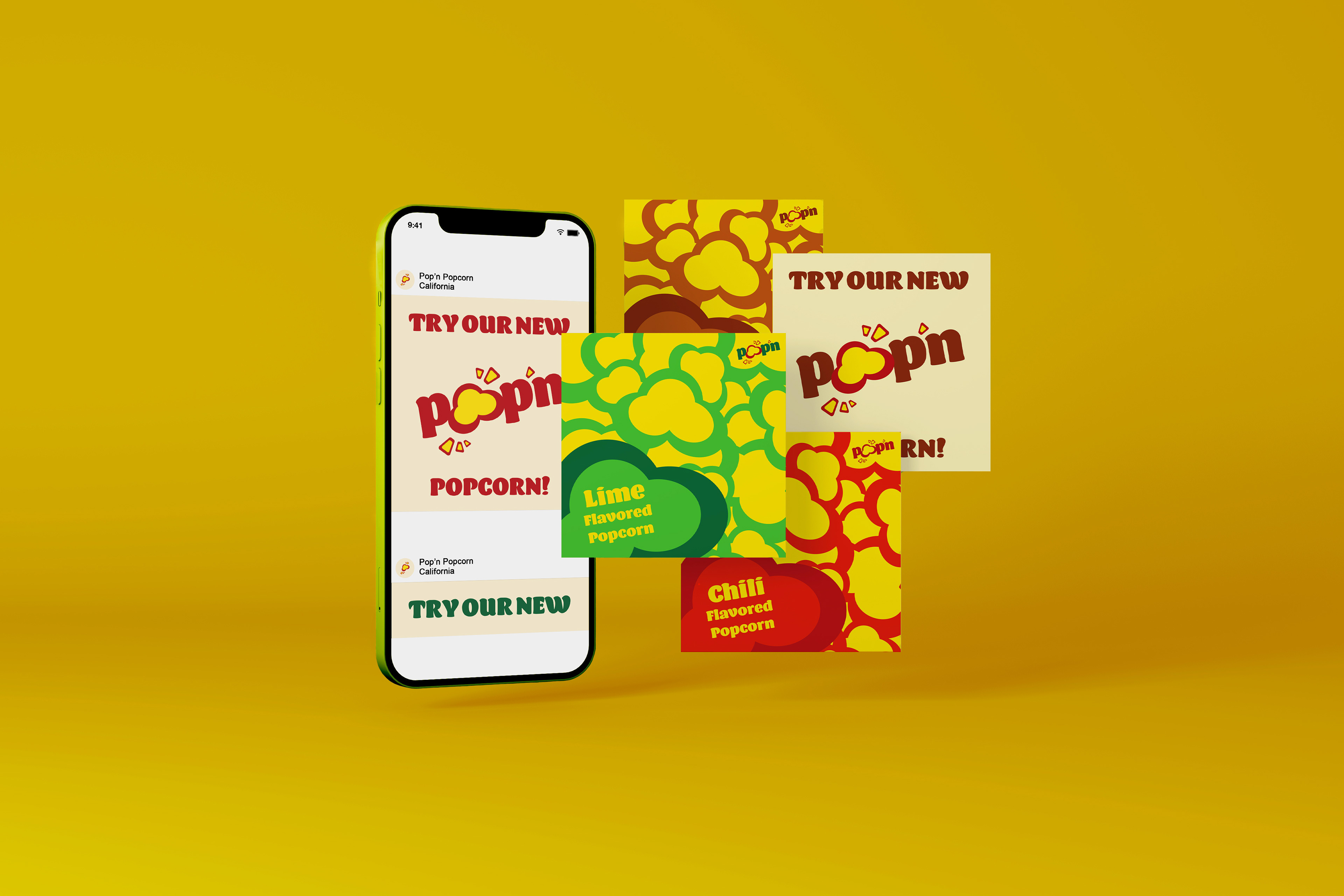
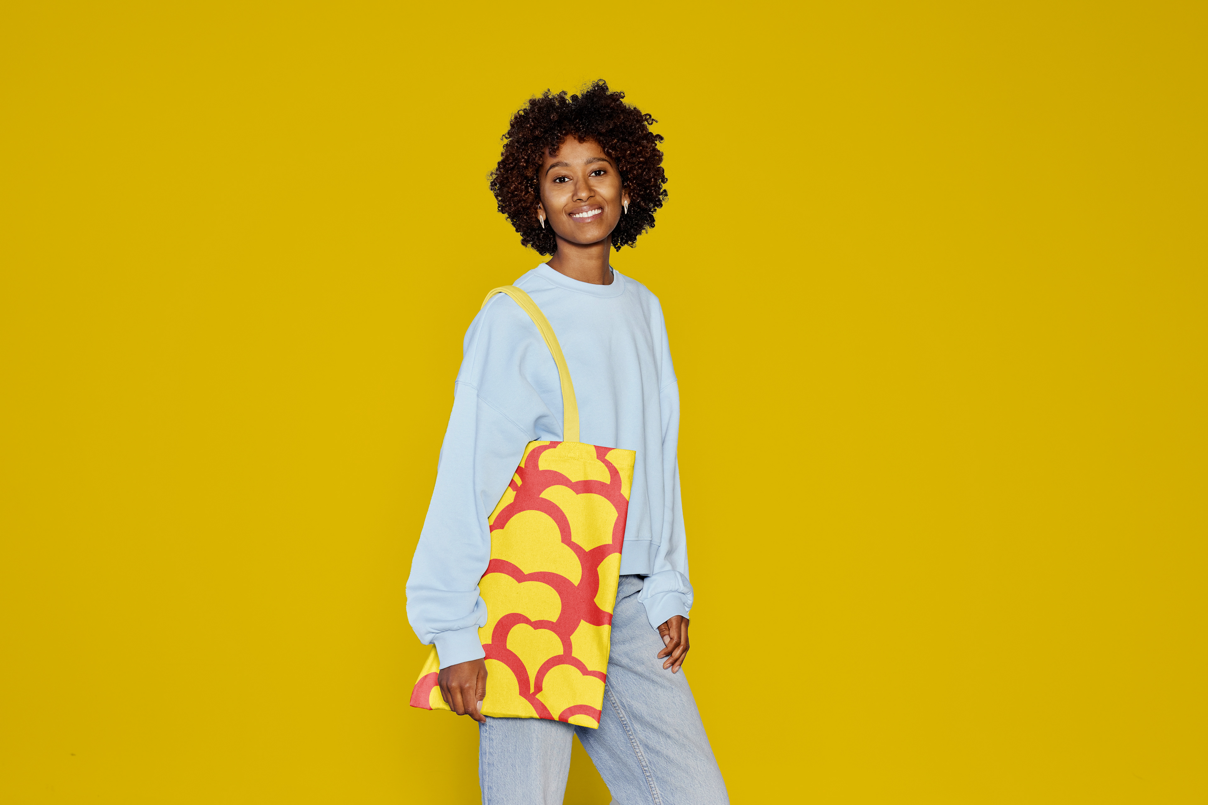
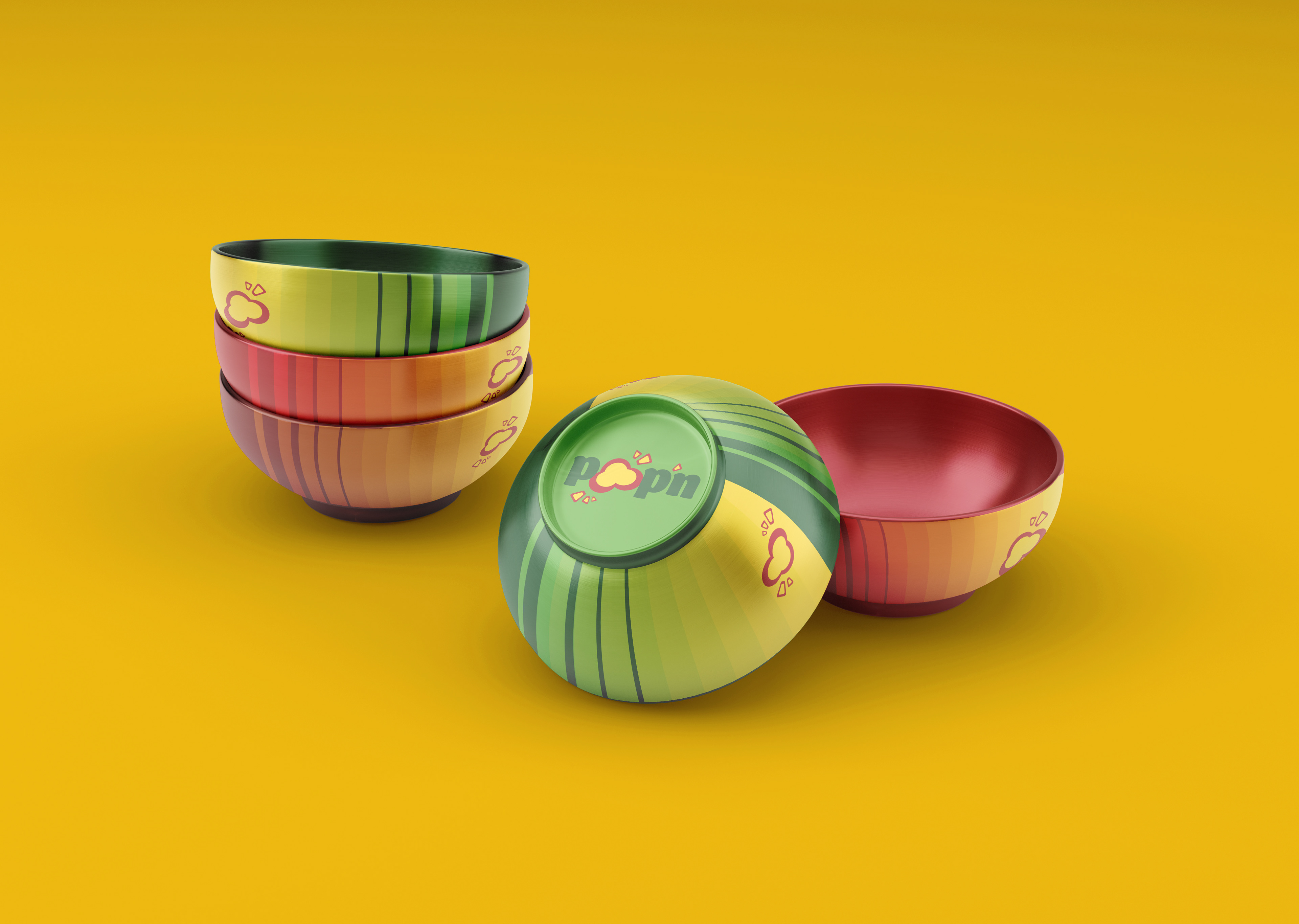
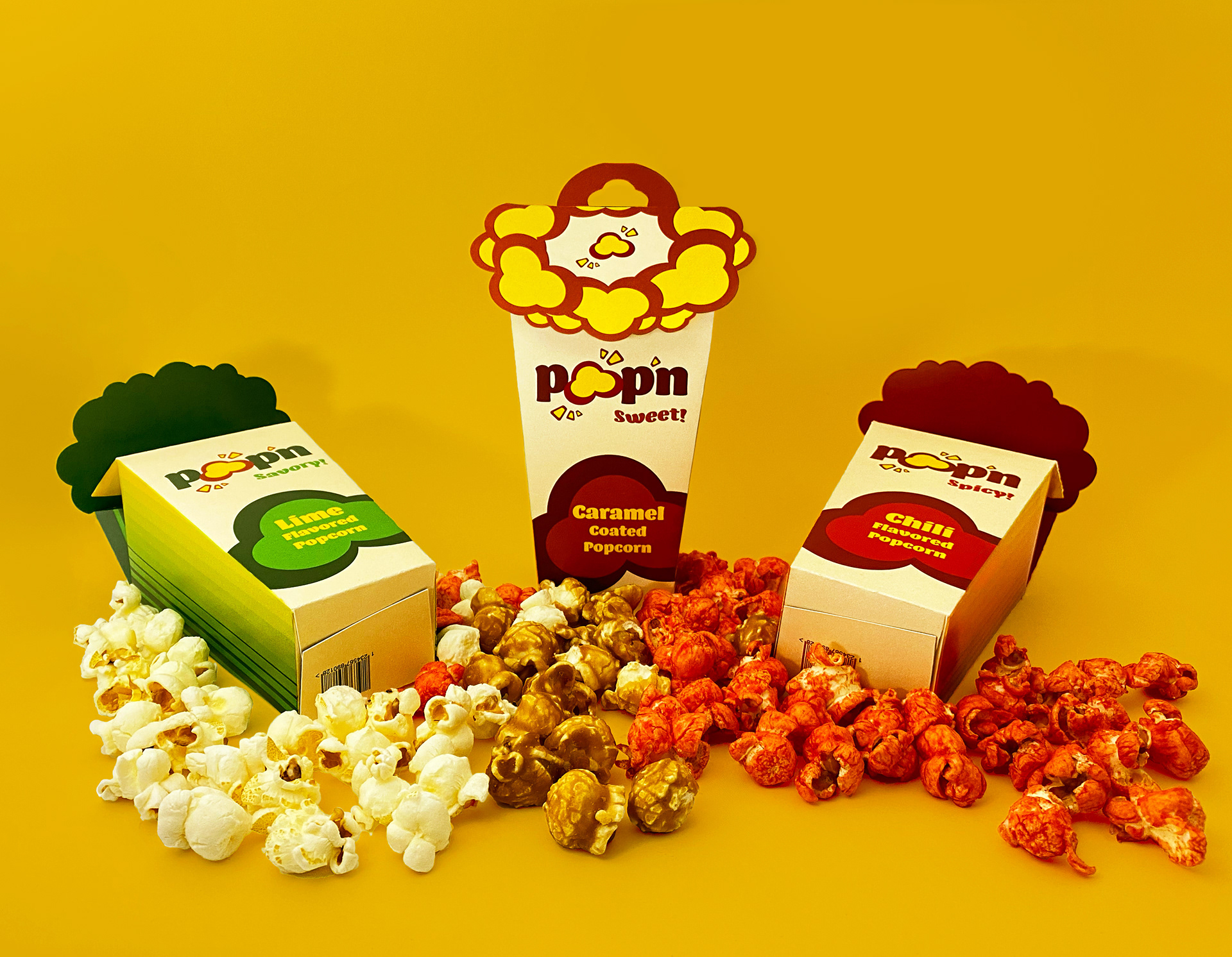
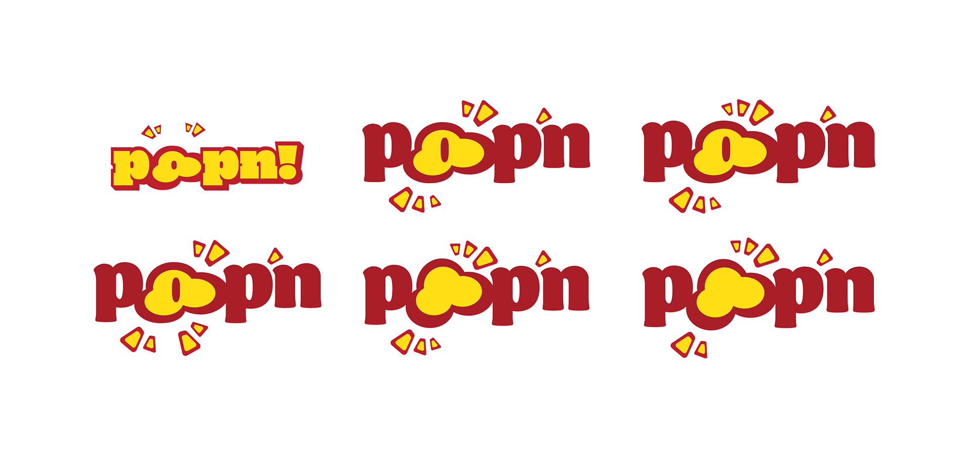
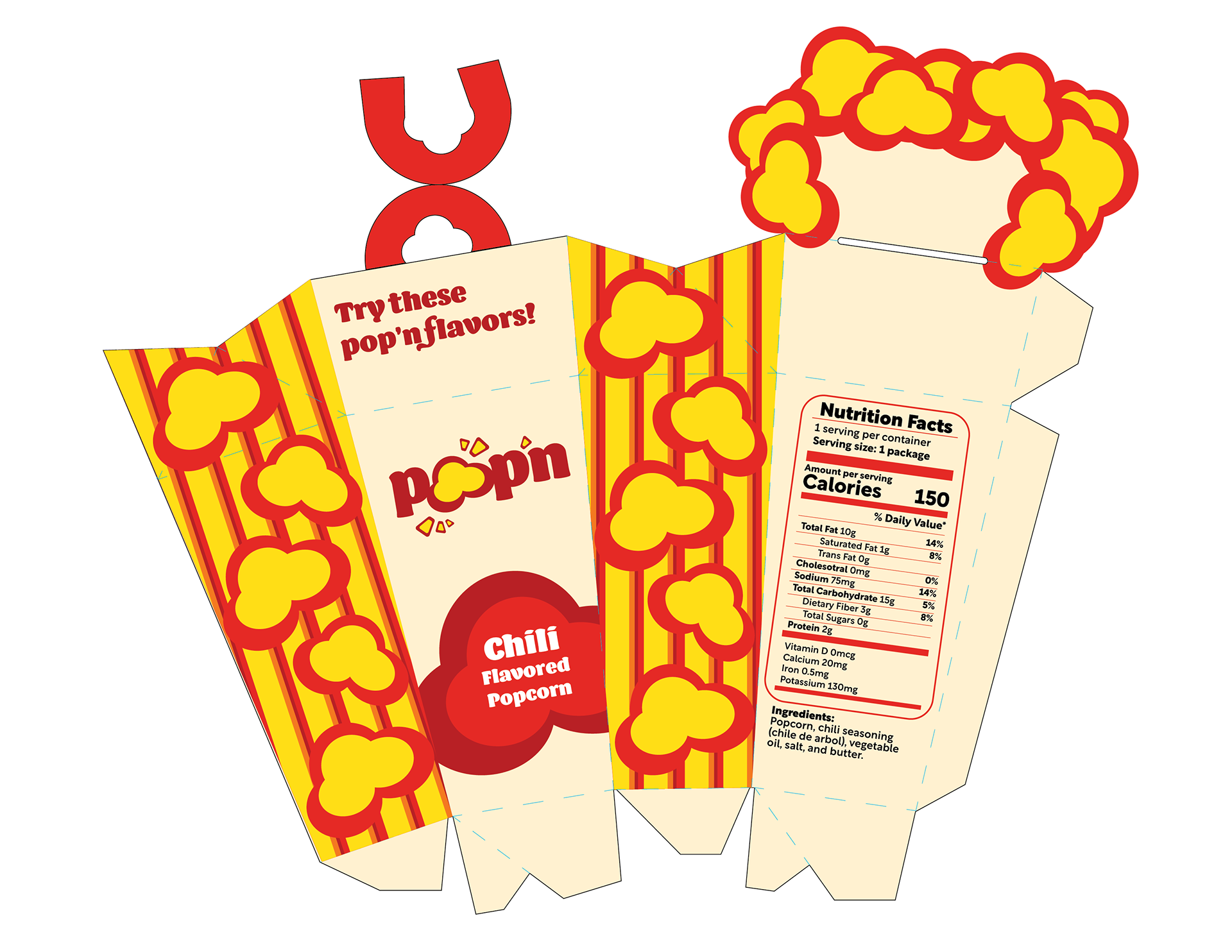
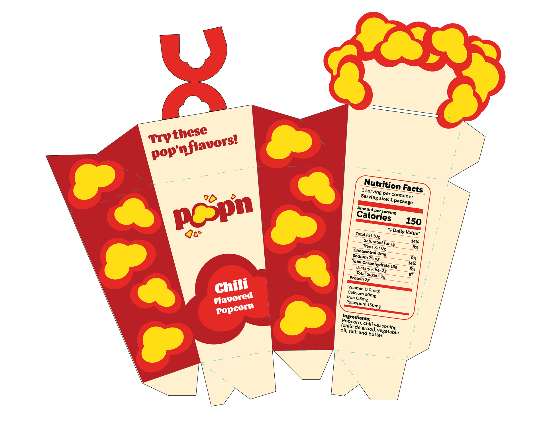
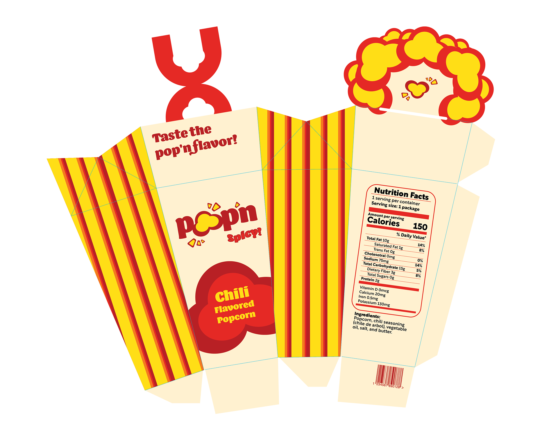
Pop'n Product
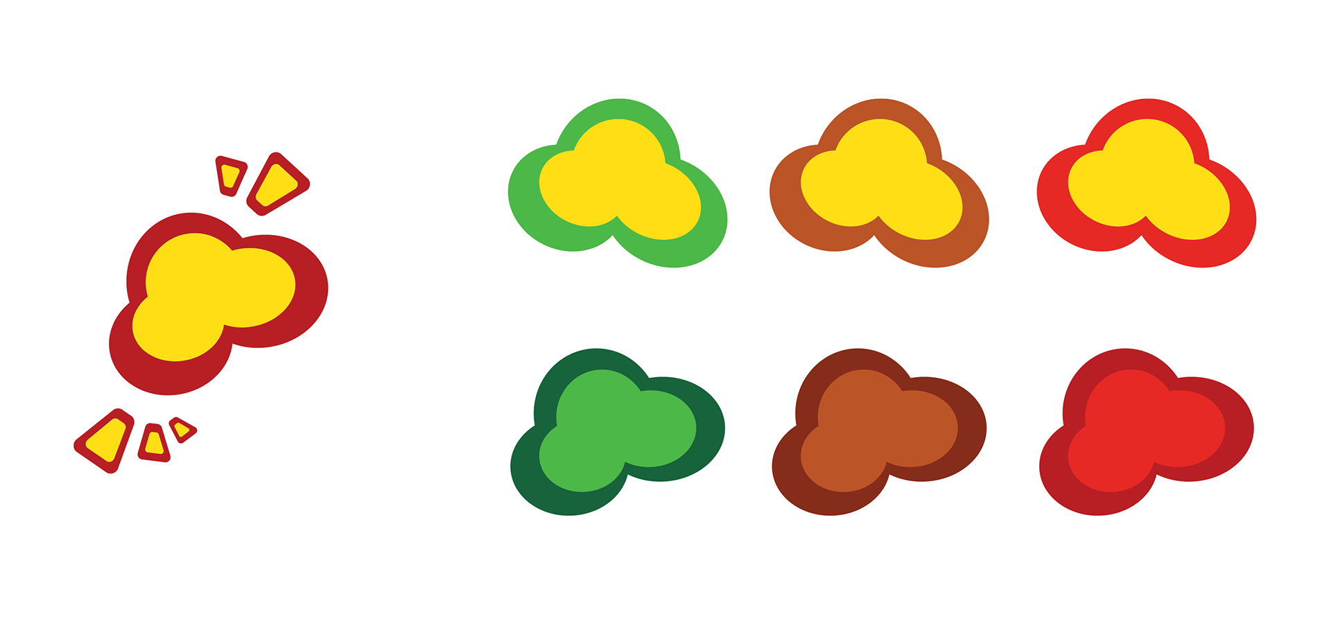
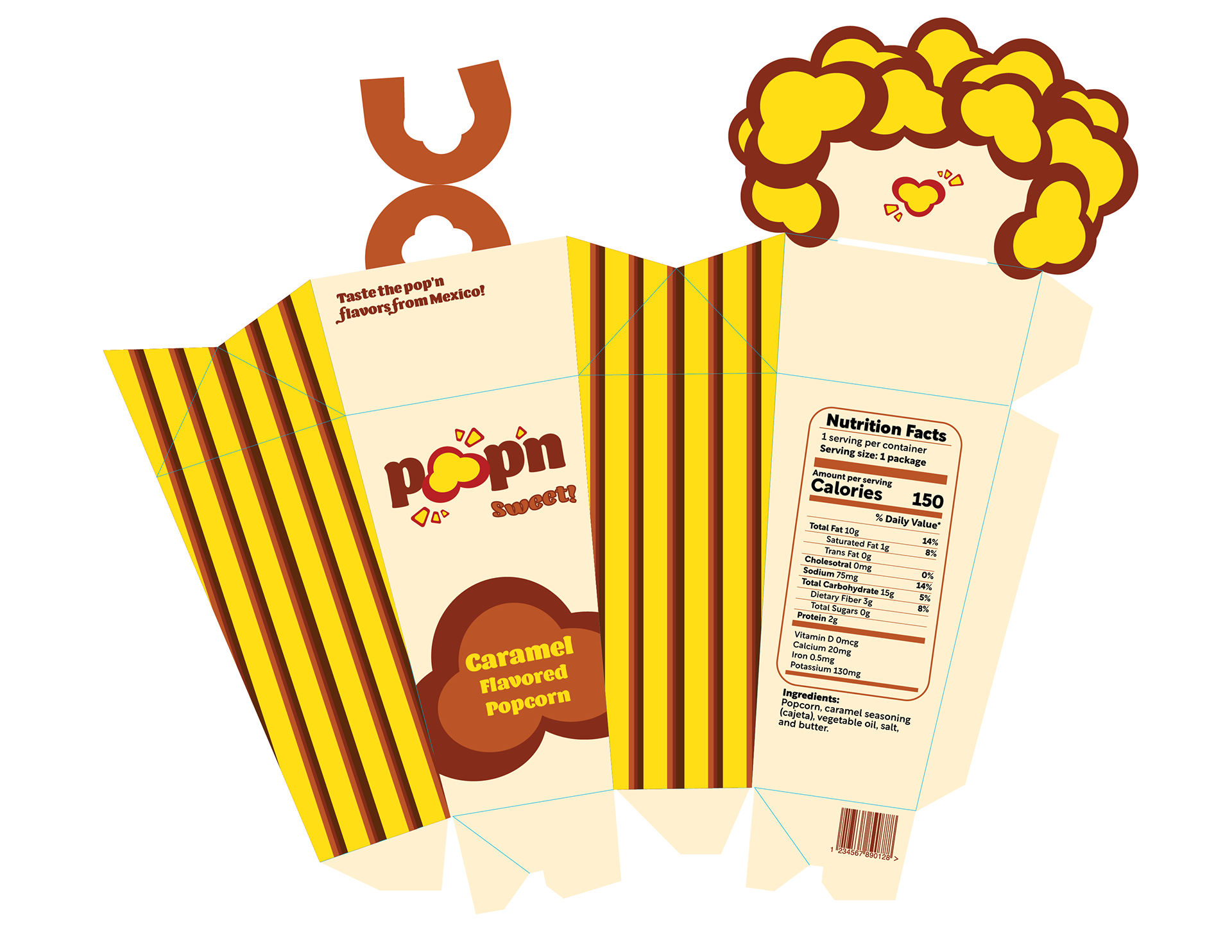
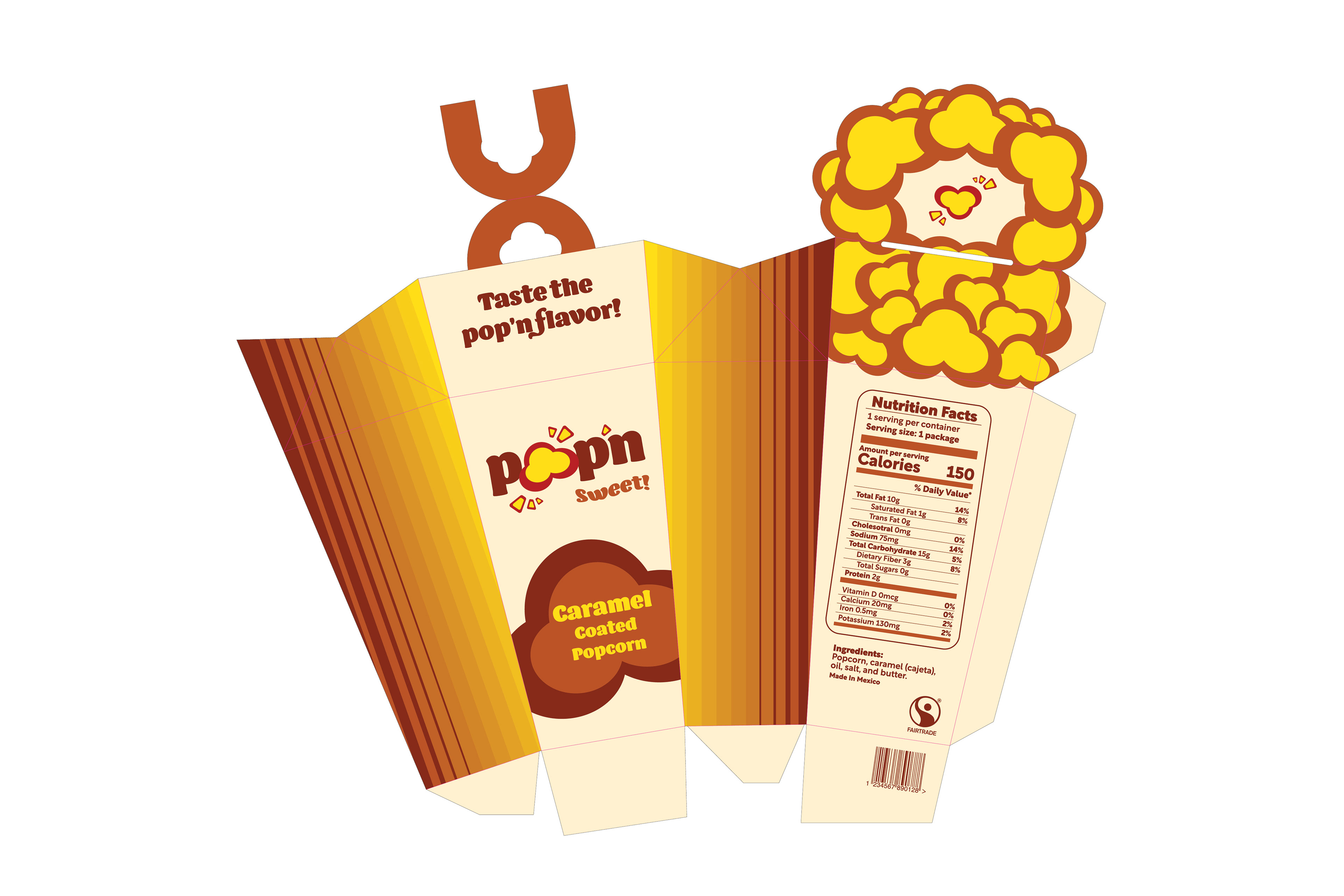
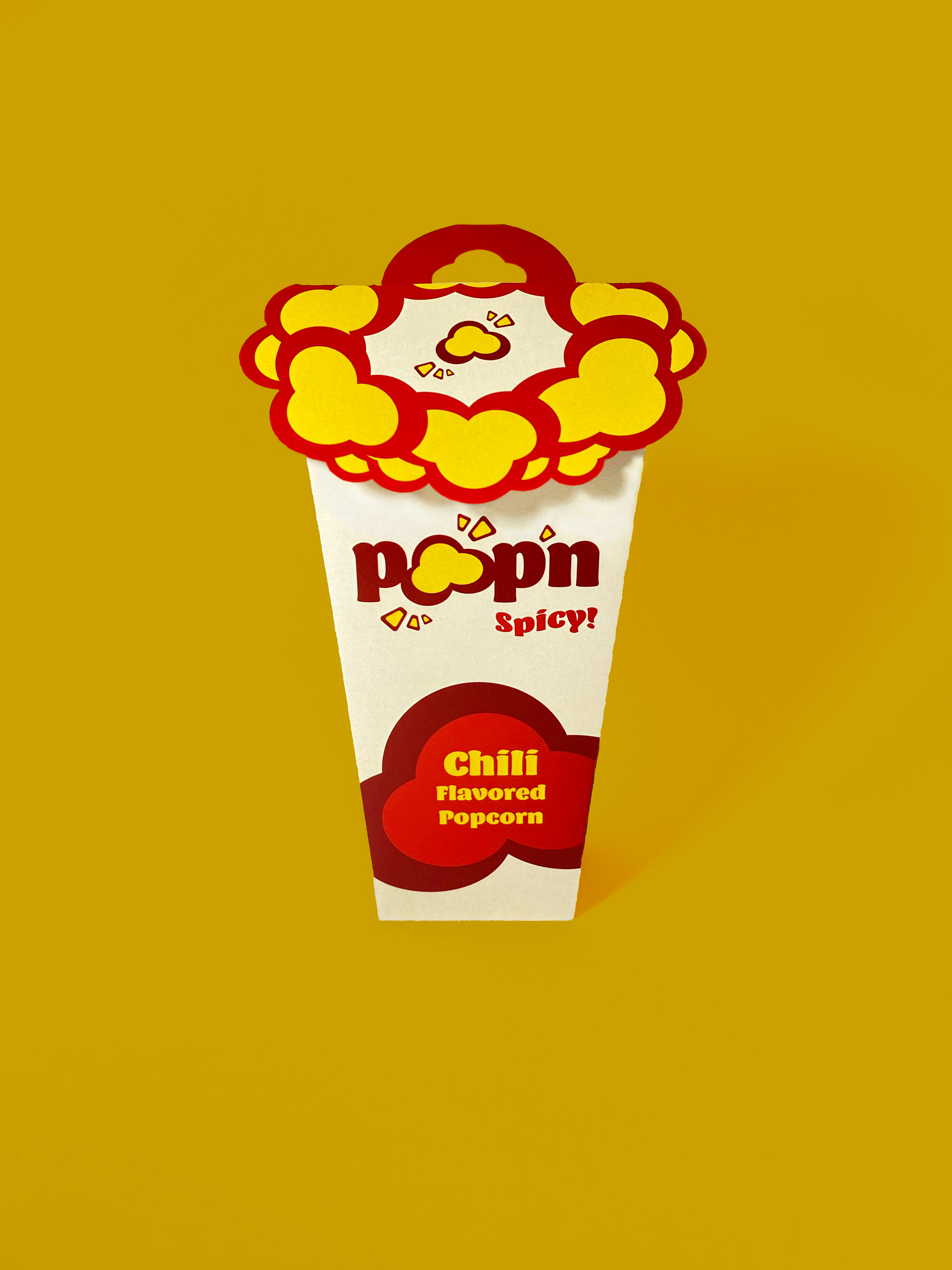
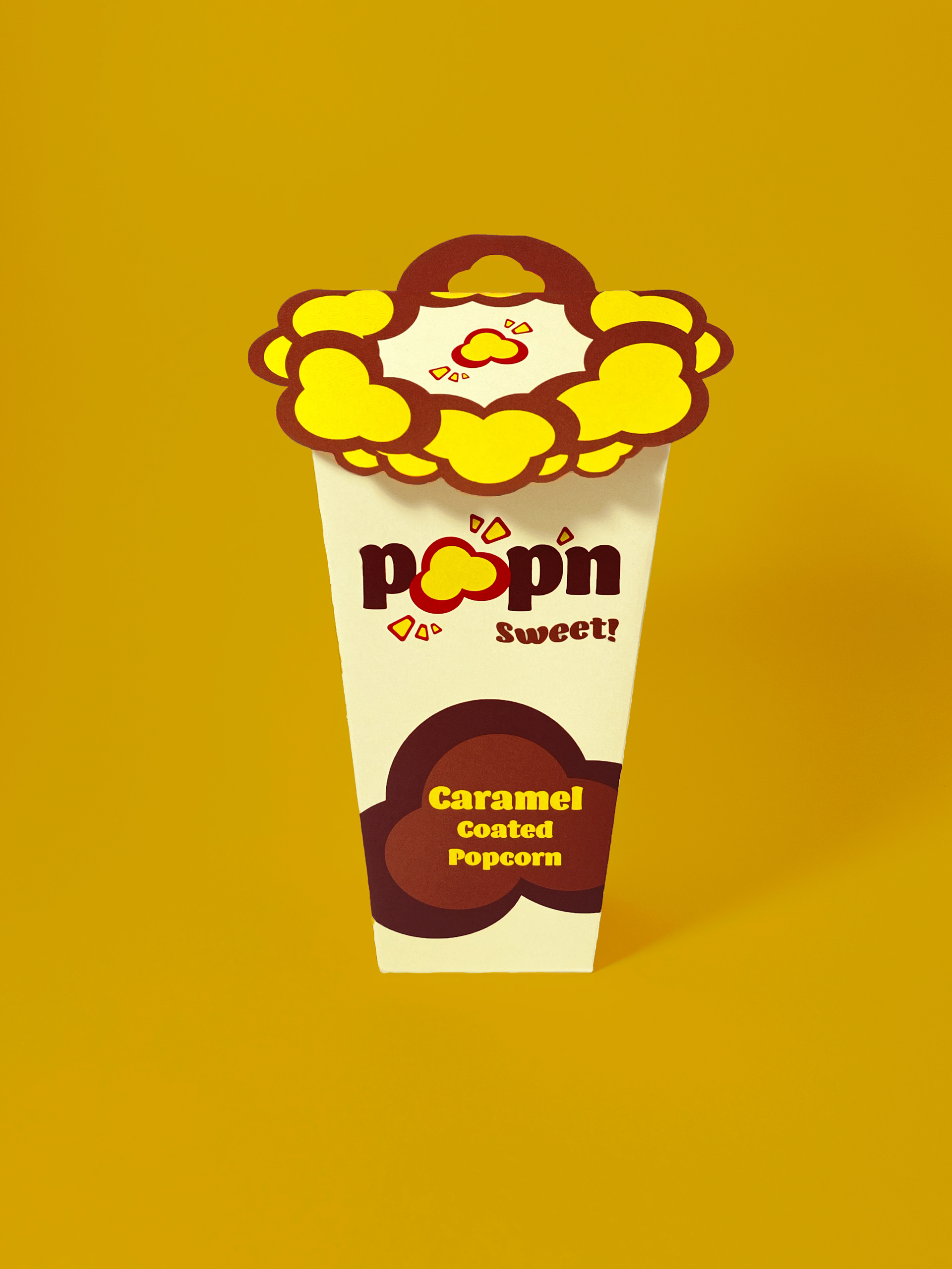
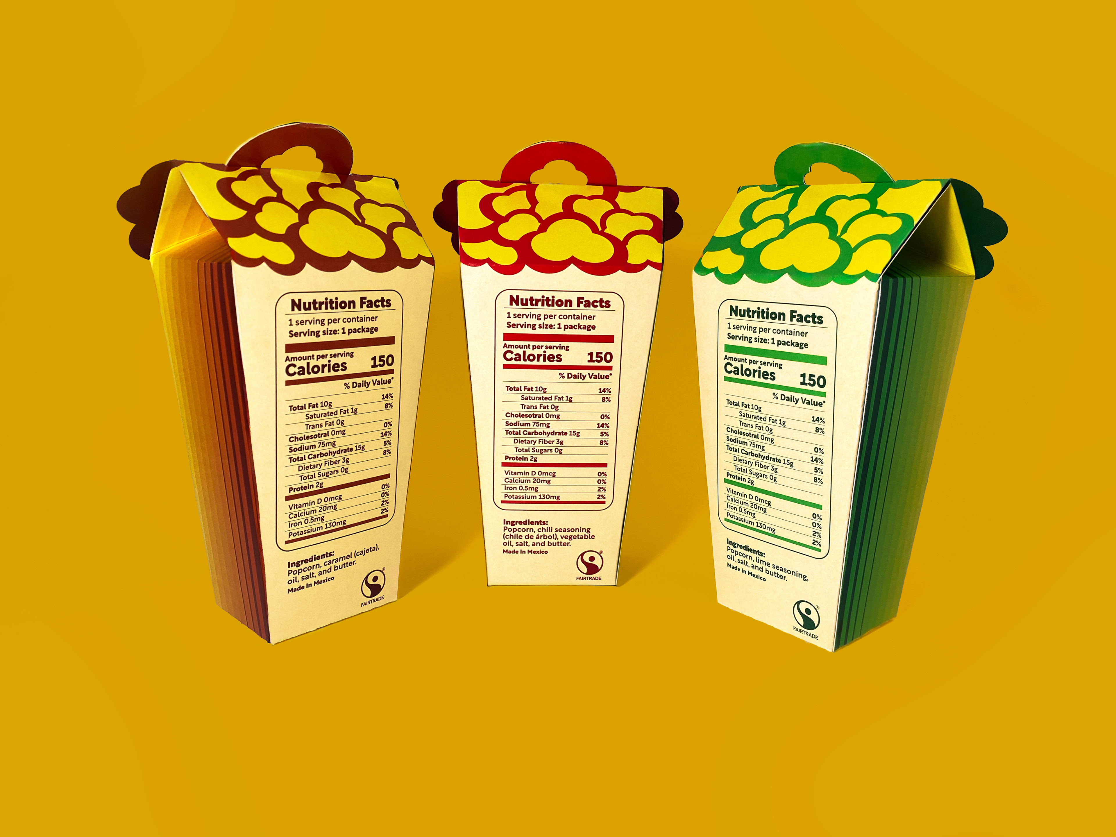
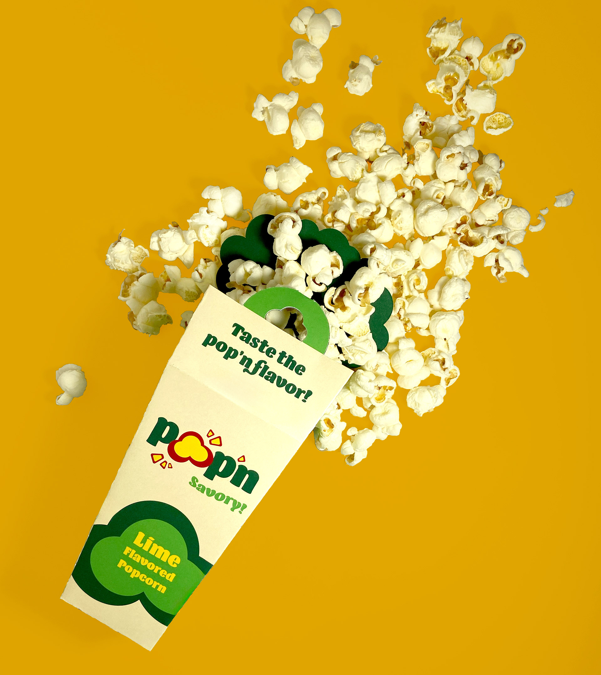
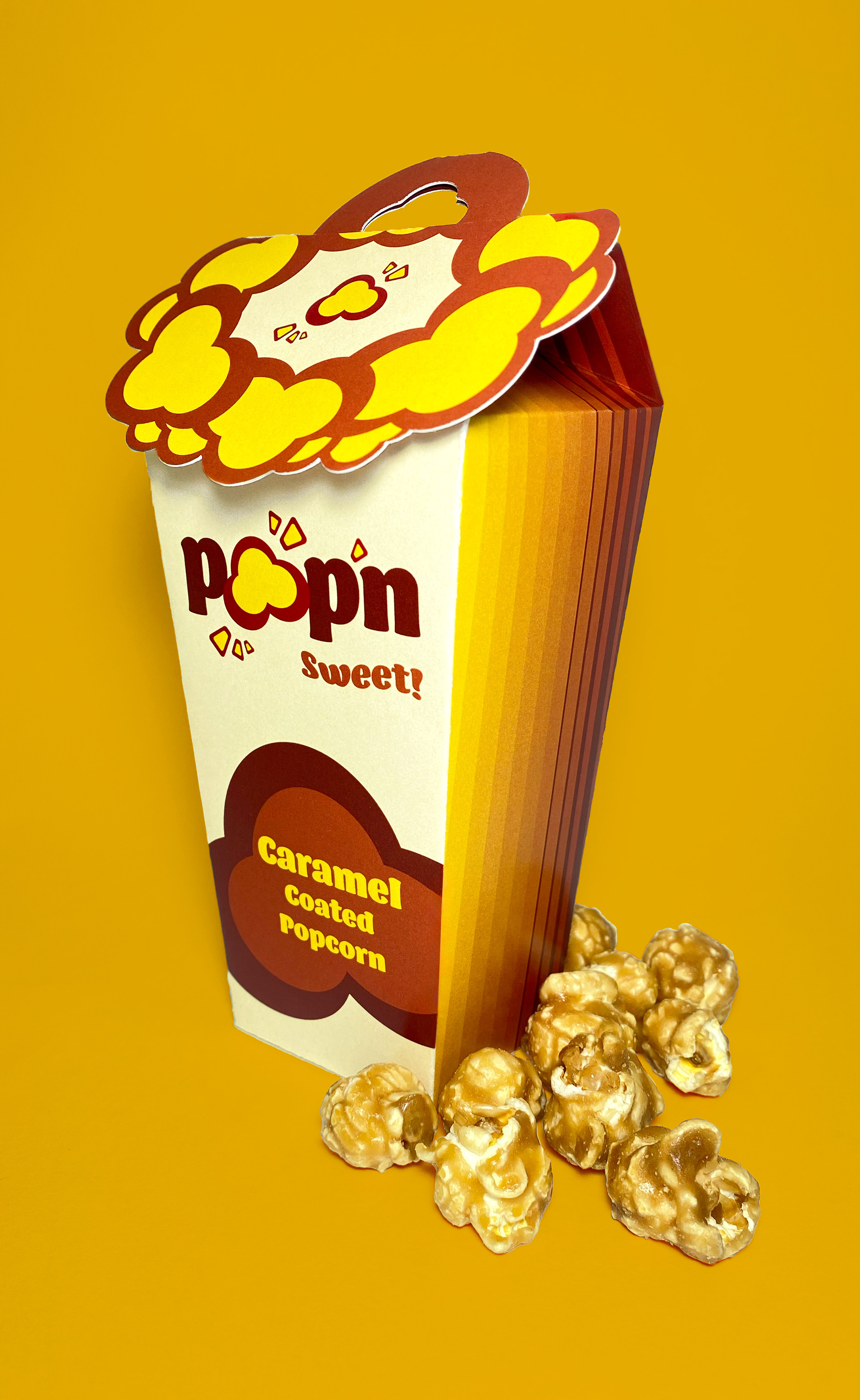
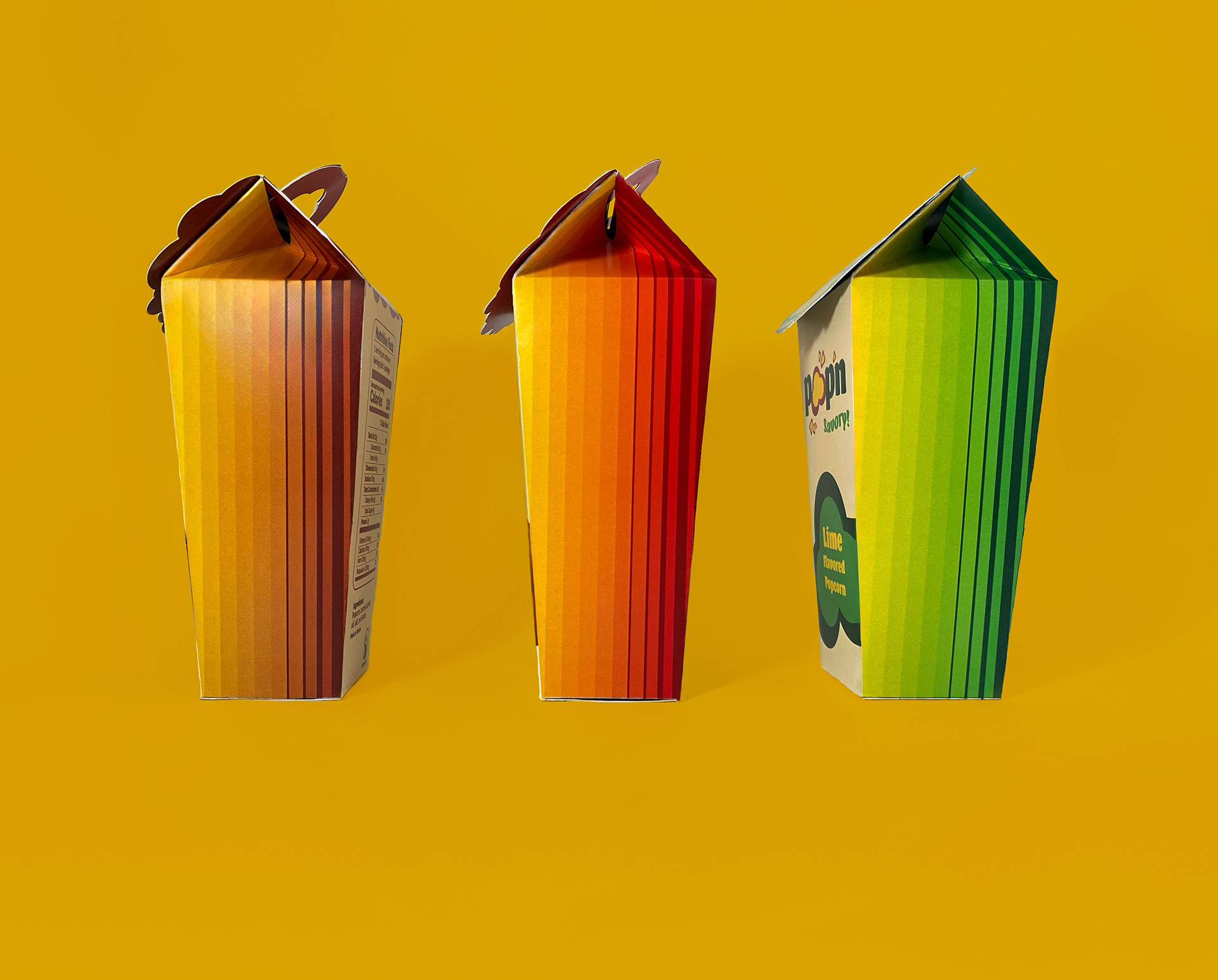
Pop’n is a popcorn brand that combines influences of Mexican culture and food. Pop’n uses colors based on Mexican textiles and traditional clothing. Pop’n is designed to be visually appealing with a fun icon of a popcorn. The design entices the audience to buy the product and taste the flavors of Mexican culture. The font on the packaging is inspired by Mexican-styled typography and packaging. The three popcorn flavors are inspired by traditional Mexican cuisine and snacks. For instance, spicy seasonings and lime are commonly used in Mexico. A type of caramel called cajeta is usually put on a slice of bread but Pop’n mixes the idea of caramel popcorn into a cajeta popcorn. Corn is also an important staple that is used in many Mexican foods, but is also farmed in Mexico.
Persona
Sam Jones is a 22-year-old single woman with no kids and a low-income job. She likes snacking, and popcorn is her favorite quick snack to eat when watching a movie. She likes to look for new, inexpensive, tasty products and cultural flavors. She enjoys Mexican food and would like to expand her snack options.
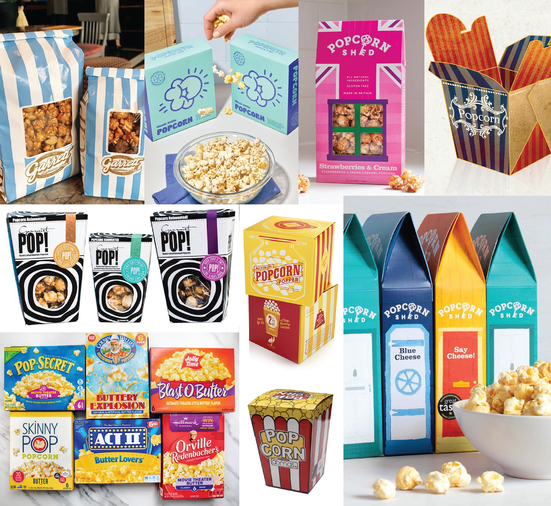
Moodboard

Sketches
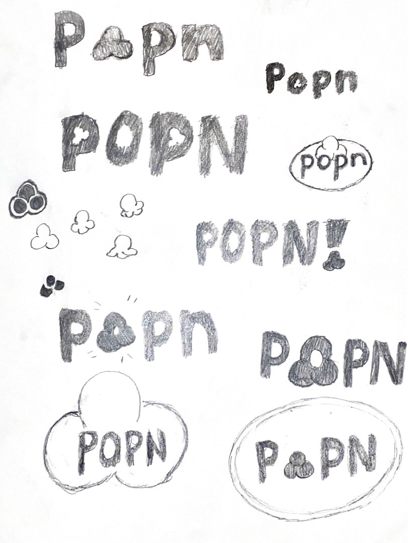
Logo Sketches
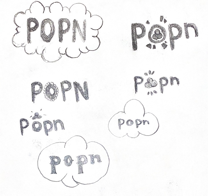
Logo Sketches

Packaging Sketches
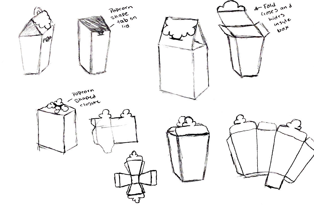
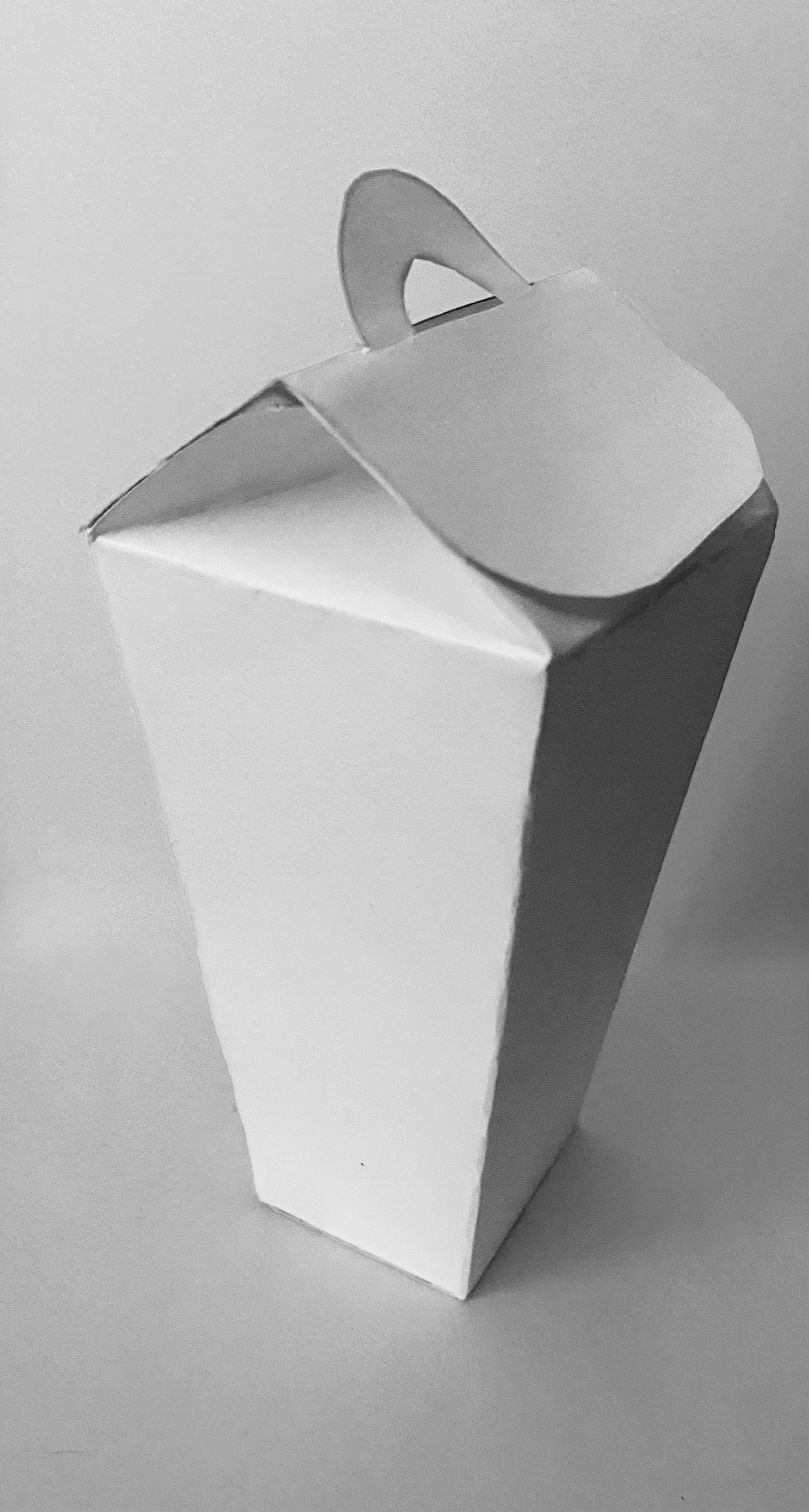
Box Sketches
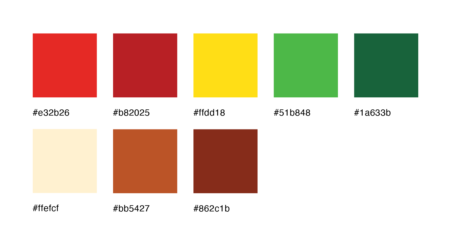
Color Palette
Vibrant hues inspired by Mexican textiles and traditional clothing.
Logo Process
Iconography
Early Templates & Designs


Pop'n Logos


Final Pop'n Dielines


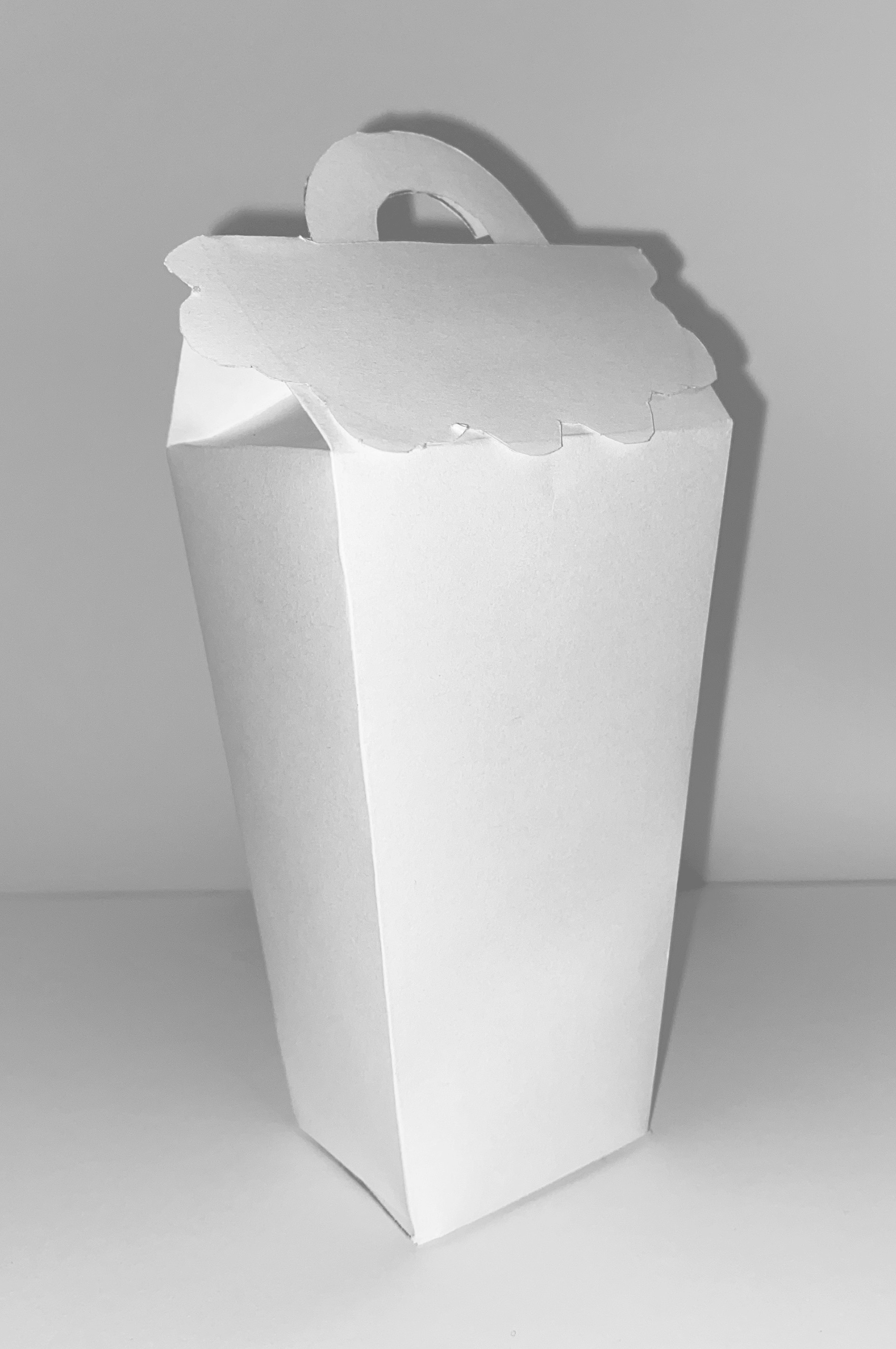
Pop'n Photos


Brand Expansion Mockups